When embarking on your next job search, updating your resume is often a struggle between a more traditional design and the need to stand out in a pile of applicants. When thinking about ways you can refresh your design, it is easy to get carried away when looking at examples online. However, it is critical to remember that while you need to get the attention of a hiring manager, it is most important that your resume is easy to read. As a result, consider these small changes that will help catch the eye of an employer while still highlighting your skills and experience:
A pop of color
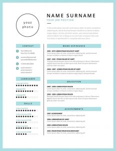
When thinking about how you might grab attention, adding color to a traditionally black and white document is one of the easiest ways to accomplish this. However, keep in mind once again that readability is imperative. As a result, consider adding a color to lines and bold headlines, and leave the majority of your text in black. This allows you to stand out without changing the content of your resume or being too flashy.
Use two fonts
In your resume, playing with fonts can be dangerous territory—not only because this heavily affects an employer’s ability to read it, but because some hiring managers just don’t like certain fonts (do not use Comic Sans, no matter what). However, while your paragraph text and bullet points should be in a more traditional and readable font like Arial or Times New Roman, your headlines can stand out more if you change them to something that speaks to your style. While you should still prioritize cleanliness and readability, there are several options where you can add more personality.
Add columns
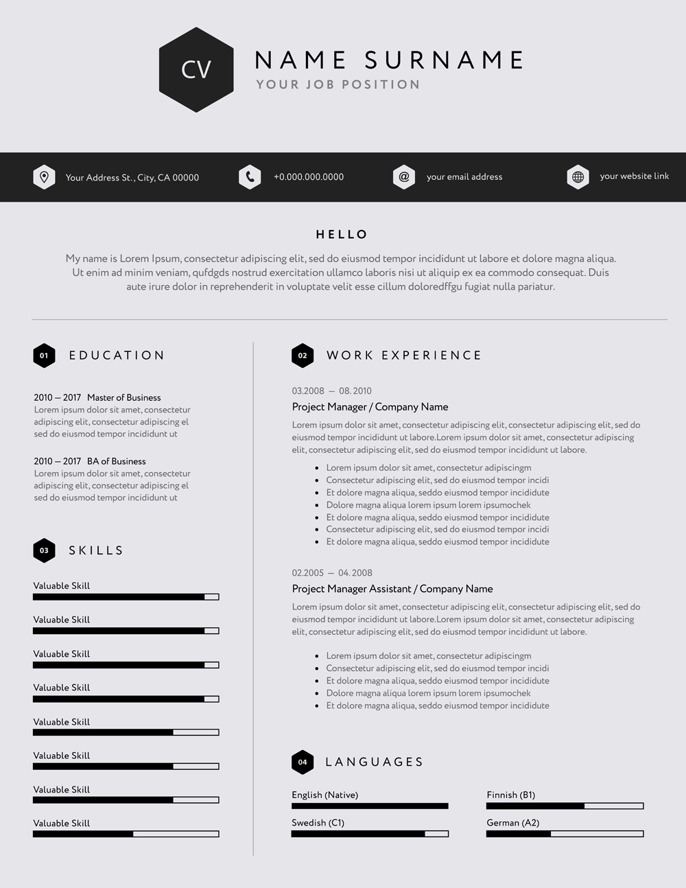
While a more conventional resume would have each section take up the full width of the page, sometimes this can actually waste space and make your resume less readable. When you add columns, this can add more structure and make it easier to find exactly what the employer is looking for. Often, job seekers create one small column and one wider column. On the larger side, you’ll have ample room to add your work experience, while the smaller column can address more about your background, education, and skills.
Use separating lines
In addition to adding columns, adding lines to help separate sections can add more structure to your resume. This could be one long line separating your columns, or it could be a thin line under each header. These lines can help guide the eye, and they also create another opportunity to add that pop of color.
Use a graph element
A new trend that has appeared is a resume design that can quantify some of your experience. Most commonly, you’ll see job seekers add a graph element to their list of skills. As a result, you’re not only able to show your skills in a more visual way, but you’re also able to give more information to the hiring manager. When you add a graph element to your skills, you’re able to indicate your level of expertise, which can give an employer a better picture of where you excel and where you may still need training.
When you implement even a few of these strategies, you may end up with something like one of these examples below. As a result, you’ve created a compelling document that is noticeable among a stack of applicants and still effectively highlights why you’re the best candidate for the job.


